The new year is a blank canvas. The sparkle and bustle of the holidays have faded, opening space in our daily rhythm to reflect and reset. No matter what came before, the turning of the calendar page offers a clean slate, a chance to reimagine the way we live, work, play and eat. The weather tends to match this more contemplative mood with a clean slate of its own: heavy grey skies, soft white snow and chilly temperatures that send us inside seeking coziness. In this moment, we’re all craving calm—inside and out. Color is one of the simplest ways to find it. Unlock the deep power of quiet color with Le Creuset’s neutrals palette, a family of soft shades that can balance and ground life in the kitchen and beyond.
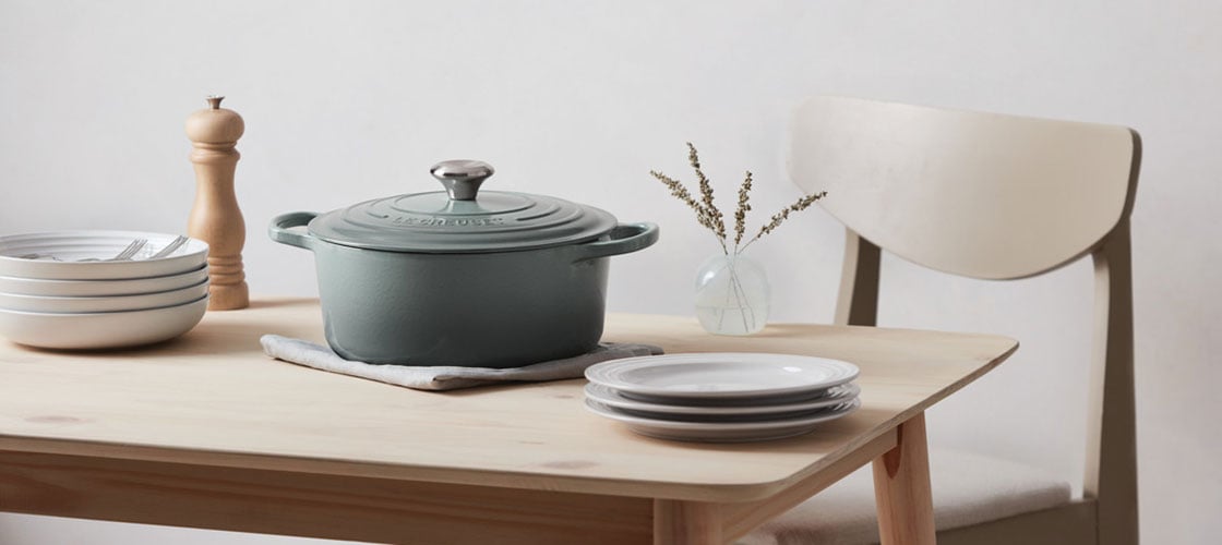
Setting the Tone for a New Year
It’s only natural that we are drawn to neutrals at this time of year. Soft whites, creams, grays and muted greens and blues provide a soothing sense of stability and order that appeals when we’re eager to find new rhythms, slow down a bit and make good on our resolutions. And this year particularly, the collective longing for restored equilibrium is strong. “With unsettled feelings and thoughts still swirling around us, there is a need to feel safe in the home, surrounded by colors we find comfortable and reliable,” explains Andrea Magno, Director of Color Marketing & Development at Benjamin Moore.
What kind of colors feel comfortable and reliable? We only have to look outside to find them. Nature’s blues, greens, and grays remind us of calming scenes or experiences: imagine waves rolling onto a beach, wispy clouds drifting across the sky, lush leaves fluttering in the wind or clear water rushing over smooth river rocks. Even just picturing those landscapes in your mind’s eye can have the effect of a long exhale. In the same way, bringing nature’s neutral colors indoors can help you create a quiet, centering refuge at home that offers a retreat from the nonstop pace of modern life.
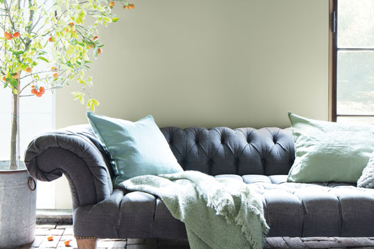
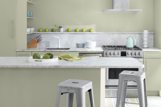
Photo Credit: Benjamin Moore
Andrea Magno goes on to point out that Benjamin Moore’s 2022 Color Trends Palette is inspired by our current human need for grounded stability and creative expression, blending “a refreshed take on the primaries, frothy pastels, earthy neutrals, and several greens for balance—something we all need right now.” Le Creuset’s neutrals collection shares common threads with the Benjamin Moore palette, including Sea Salt, our soft, silvery sage green that is a close cousin to October Mist, Benjamin Moore’s 2022 Color of the Year. Both greens have a reassuring hint of gray to their hue that makes them very versatile across a range of color palettes and applications—a true neutral.
“Neutrals often offer a feeling of stability or grounding in a space, or they can signal a fresh start or a blank canvas which is often tied to the idea of a reset.”
Andrea Magno
Director of Color Marketing & Development
Benjamin Moore
Start with a Clean Slate
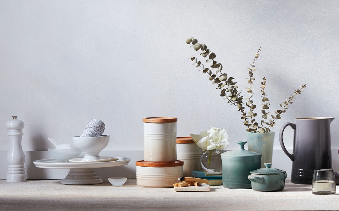
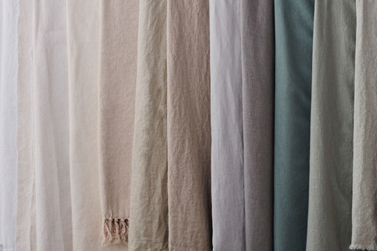
Like a deep breath, Le Creuset’s neutral colors—White, Meringue, Chambray, Sea Salt and Oyster—harmonize together to create a layered, grounded, calming effect or work on their own to soften a more colorful palette. Depending on your aspirations or aesthetic preferences, you can play with different neutrals to achieve your ideal vision of calm. Add lots of bright White to your existing color palette if you’re aiming for a cleaner, crisper look, or layer in the muted gray-blue or gray-green of Chambray and Sea Salt if you simply want to soften a bolder expression.
Maybe you want a total reset? Sounds like it’s time for a complete transition to the airy, clean hues of White and Meringue. You could even lean into the earthy side of neutrals by embracing the emotive silvery-sage of Sea Salt and warm gray-brown of Oyster. There are so many ways to start a new year. The best part is that it’s still a blank canvas—ready for whatever you bring to it.
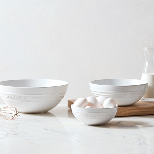
White
A beacon of pure light, White is the kitchen’s chameleon — the brightest point on the color spectrum. A color that needs no introduction, yet perfectly presents all others.
Shop White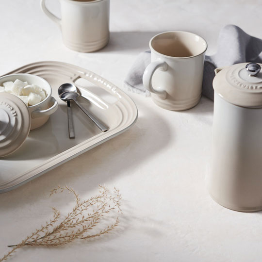
Meringue
Inspired by the French classic confection, beloved universally for its sweet simplicity. Meringue is a serene ivory, perfect to layer with soft tones or as a go-with-everything neutral.
Shop Meringue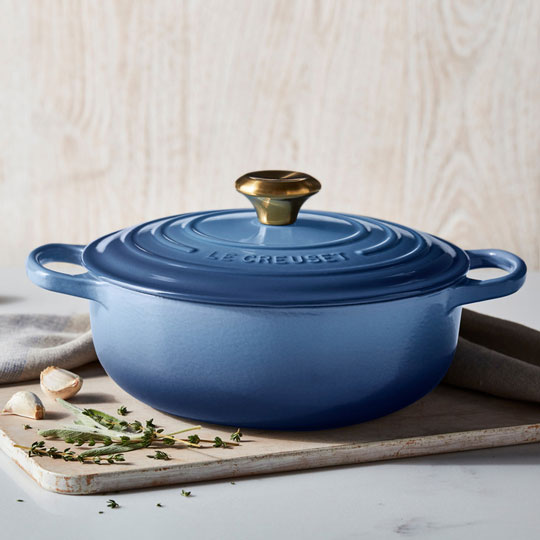
Chambray
The softest slate blue with gray undertones, Chambray is flexible enough to complement rich and bright tones, or to add texture and flavor to a crisp, neutral palette.
Shop Chambray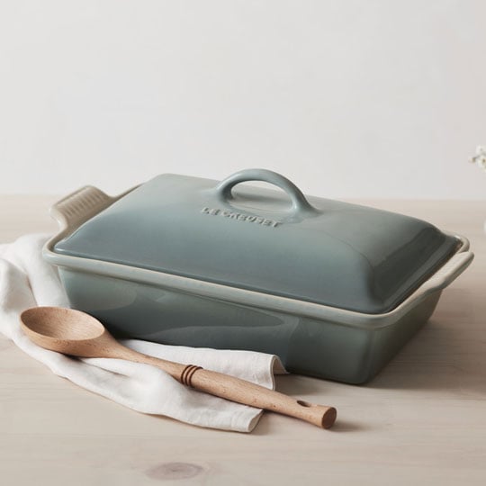
Sea Salt
Inspired by the sea’s most treasured mineral, Sea Salt is an elemental pinch of flavor. Ready to enrich any décor and enhance any taste with nuanced subtlety and style. Let it season a neutral palette or be a balm to bolder hues.
Shop Sea Salt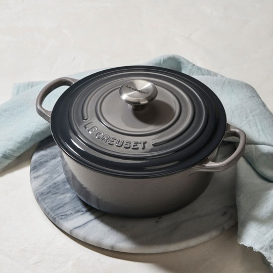
Oyster
A lustrous mix of gray and brown with a seductive glint of purple. The mesmerizing iridescence of Oyster adds a luxurious touch, wherever it is placed, whatever treasure it holds.
Shop Oyster
